
Karin Söderquist, Illustrator
owl sqare
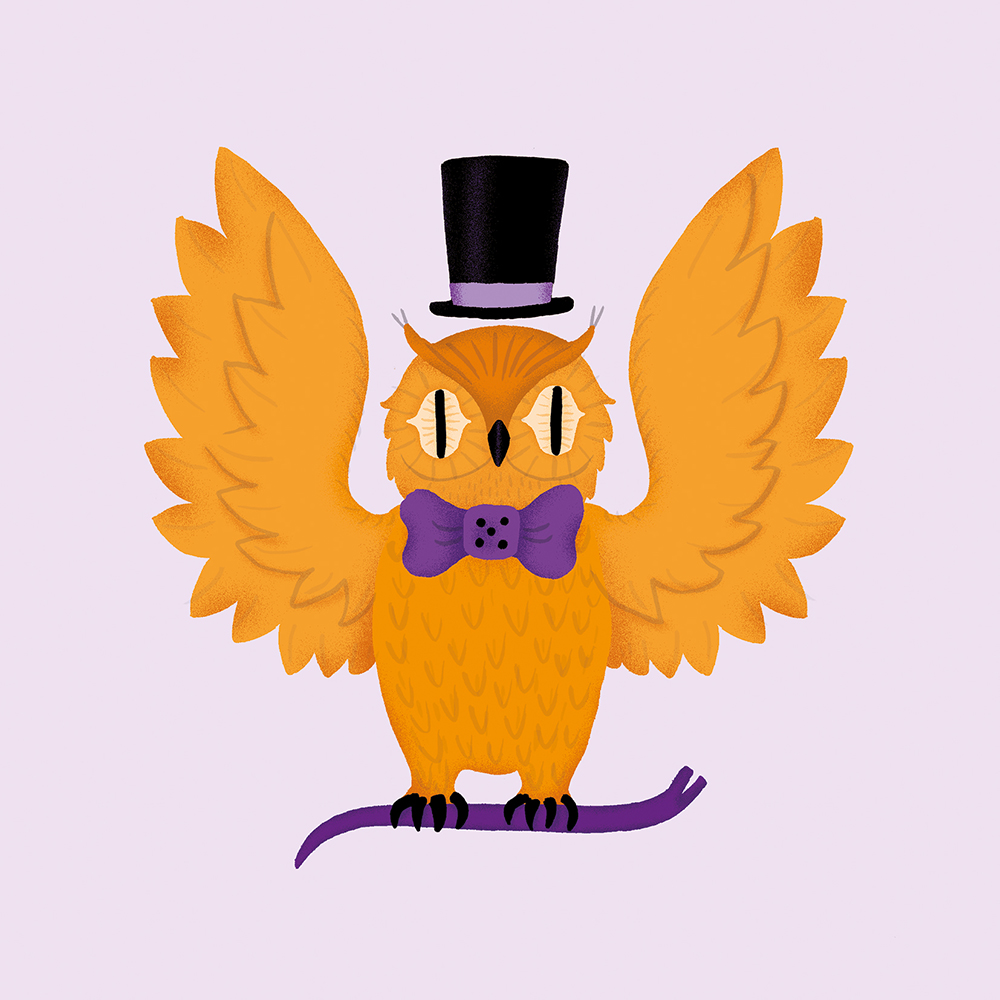
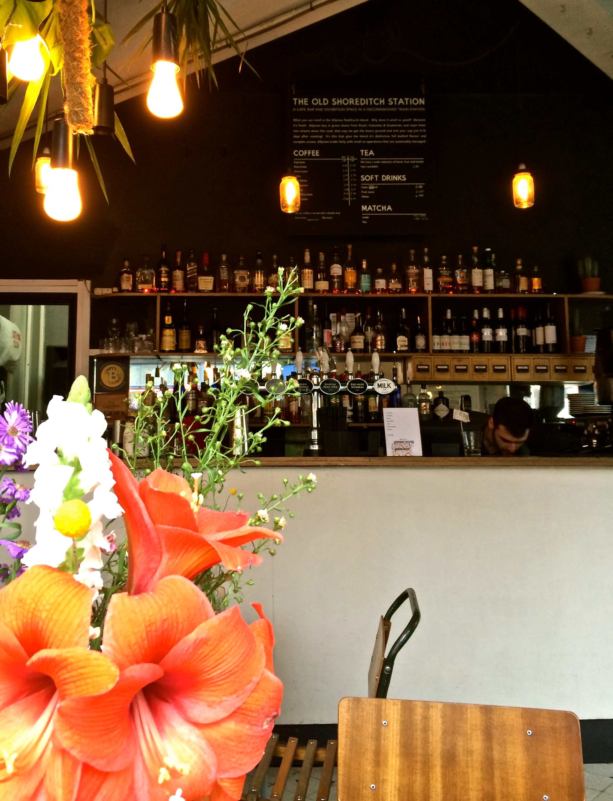
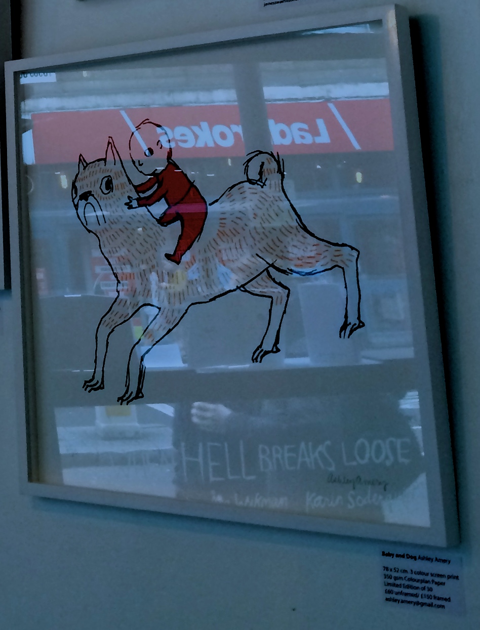
I recently took a trip to Shoreditch on my bicycle. It was a beautiful sunny day, and I took a leisurely route avoiding the main roads - through the back of Stockwell, past Oval, over Southwark Bridge and up past Finsbury Square. I made it to Shoreditch and tied my bike up in a very snazzy bike rack (green and in the shape of a car, Shoreditch is very trendy).I went to find The Old Shoreditch Station which is a cafe and bar in a decommissioned station. It's pretty difficult to tell it was ever a station, although there is a nice map on the wall explaining which rooms were which part of the station. I had a lovely coffee and sat in the window - and I rather like it as a place - you order your coffee 'in' at the bar, and take it with you to sit where ever you like, and they don't fuss over you too much. It has a very easy going vibe, definitely the sort of place you could take a book, or an essay to be written and sit for a while and that would be just fine.So the main purpose of my trip to The Old Shoreditch Station was to see an exhibition of works by Bat Country Collective entitled When Hell Breaks Loose. I really like illustration and Bat Country Collective are a London and Stockholm based group of illustrators who create rather charming and often quirky illustrations. I really like this concept - illustrators with different techniques and styles, collating their visions to create collections and curate exhibitions.The illustrations are very much hung as though they are works of art specifically bought and displayed for the coffee shop - so I did do some awkward photo taking over people enjoying their coffee (thank you for your patience!!).I enjoyed the lino prints by James Swain and also Asa Wikman's motivational unicorn is just super.But it was Karin Soderquist's illustration's based on Russian prison tattoos caught my eye. They were inspired by FUEL's Russian criminal tattoo archive - and the combination of almost comical images tattooed onto rather terrifying Russian criminals and recreated by Karin in bright, colourful rather fanciful illustrations is bizarre and delightful.I asked Karin some questions about the concept behind this exhibition, and her illustrations:
Explain to me a little bit about your work as an illustrator, and the techniques you use?
I studied illustration at Camberwell College of Art and graduated in 2011. Since then I've been freelancing part-time and worked on a range of different projects, mostly editorial illustration but also some advertising, food illustration and packaging design. My work is a mix of digital and hand-drawn illustration. All the colours are digital but the base of the illustration is always a drawing. Bat Country Collective formed as a fun way to collaborate and support each others work and “When Hell Breaks Loose” is our third exhibition in London. We've had different members but right now the collective is made up of me, Åsa Wikman and Ashley Amery.
How did you and Bat Country Collective arrive at the theme 'When Hell Breaks Loose'?
Coming up with a theme for a group show can be tricky. It has to be something that feels fun and inspiring for everyone taking part and something that is wide enough for everyone to be able to create the kind of work that they enjoy. As we live in different countries, I'm in Stockholm and the rest of the collective is in London, we usually communicate via Facebook. We had a bit of a brainstorm on there and decided on ”When Hell Breaks Loose”, it triggered all of our imaginations!
How and why were you inspired to use the Russian prison tattoos for these works?
I was given all three of FUEL's Russian Criminal Tattoo Encyclopedias for Christmas last year. After looking through them I knew that I wanted to make my own versions of some of the amazing tattoos. This exhibition felt like a perfect time to start working in the project, being in prison probably feels a lot like being in hell.
I love your colour combinations - do you have a colour palette you always work with, or do you change it depending on project?
I love colours and sometimes it comes really easily, the colours I want to use for a certain illustration. Other times it takes a bit more work to find something that feels right so that the colours play off each other nicely. I have a few combinations that I keep coming back to, but I try to challenge myself and not always use the first combinations that pops into my head. I usually spend a lot of time playing around with the ”Hue and Saturation” in Photoshop!
Do go and see this exhibition at The Old Shoreditch Station, it is on until mid-May, and definitely have a coffee :-)
Alice xxx

IMG_4588
IMG_4595

IMG_4597

IMG_4598

IMG_4603

IMG_4601

Krokodil square (1)

Lady square

cat square

IMG_4599
IMG_4599
